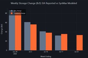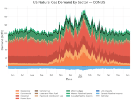

Executive Summary US natural gas demand is reported by EIA only monthly and on roughly a two-month...
We previously announced publication of this data, with directions on how to access the data, as well as a set of prebuilt dashboards to streamline your access to the data. This note will discuss the details of how we are modeling each component of demand. It should be noted that the s/d and storage numbers shown in these charts and tables are taken from a snapshot of SynMax’s models, which can change daily per the methodology described below.
The forecast is built component by component, each to its own physical drivers: the four weather-driven sectors respond to temperature, price, and economic activity; LNG feedgas follows the liquefaction train schedule terminal by terminal; pipeline trade with Mexico and Canada follows its own seasonal and weather patterns; and the supporting fuel uses move with production and throughput. Rather than a single point estimate, we publish one demand path for each historical weather year, so the range of outcomes is visible alongside the central case. Combined with our production forecast, the components roll up into a full daily supply and demand balance and a projected storage trajectory.
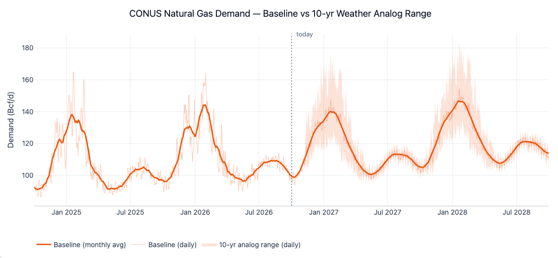
The chart shows one continuous series: to the left of the marker is our measured daily demand, calibrated to EIA; to the right is the forecast (for all demand and supply components bar production). The forecast carries the same seasonal shape and daily texture as history, so it can be read on the same axis and compared directly with past winters and summers.
Pick Your Weather Year for the Forecast
Weather is the single largest source of uncertainty in gas demand, so the forecast is built around it. For the coming weeks, each region's demand is driven by the latest NOAA ensemble weather forecast. Beyond the reliable range of that forecast, the model blends over ten days into the actual day-by-day weather of a historical gas season, April through March, for every season from 2001 through 2025. The result is 25 complete demand paths, each answering one question: what would demand look like if that year's weather repeated?
The headline baseline is the average demand across the ten most recent weather years. This is deliberately not demand at "average weather": demand responds quite nonlinearly with respect to temperature, and averaging the demand outcomes preserves the weight of cold snaps and heat waves that a smoothed temperature profile would wash out. The full set of weather years is published alongside the baseline, so the spread between a mild and a severe winter is directly visible.
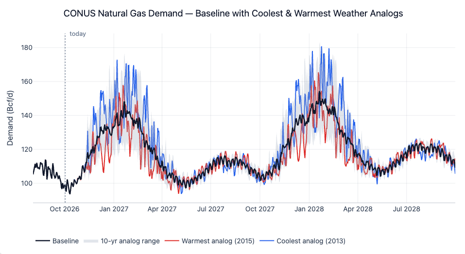
All paths coincide for the first few weeks, where the GFS Ensemble weather forecast drives every one of them, then fan out once the historical weather analogs take over. The width of the band is the weather risk.
The Core Sectors
As in the nowcast, the core sectors are Residential, Commercial, Industrial, and Power Burn. Each is forecast with a separate model for every EIA storage region, trained on our EIA-calibrated daily demand history. Because the forecast learns from the same series it extends, it picks up where measured demand leaves off, and each sector uses the drivers and functional form that fit its behavior.
Residential and Commercial
Residential and commercial demand is driven by space heating, so its forecast rests on regionally-averaged population-weighted heating degree days also weighted by the number of homes in each county that heat with natural gas. The models capture how the heating response changes through the season, so an early-season cold spell and a mid-winter one of the same severity produce different demand.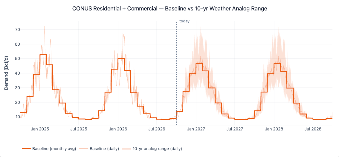
Power
Power burn responds to both weather and price. The forecast combines the cooling and heating response (again using population-weighted CDDs and population- and heating technology-weighted HDDs), including the steep rise in extreme heat, with the price of gas: realised Henry Hub and regional prices up to today, and the forward curve beyond, so a shift in the strip feeds straight through to projected gas-fired generation. A structural growth trend fitted to the EIA record and adjusted to our opinion of overall load growth carries the steady rise in gas-fired load over time.

The summer cooling peak dominates the chart, with a smaller winter peak on cold days.
Industrial
Industrial demand is mildly weather-driven because much of it is used for process heat. Its forecast combines a modest HDD response with calendar effects and national real GDP, which follows EIA's Short-Term Energy Outlook growth path forward. The economic term carries the slow, activity-driven trend, so industrial demand moves mostly with the economic outlook rather than with the weather.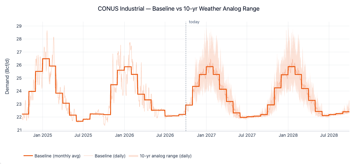
Other Components
LNG Feedgas
LNG feedgas is the fastest-growing part of US gas demand, and over the next two years most of that growth comes from new liquefaction capacity starting up. We forecast feedgas daily, terminal by terminal, as each terminal's available liquefaction capacity multiplied by a utilization rate, capped at a physical maximum.
Capacity comes from the published schedule of liquefaction trains, tracked facility by facility, including the new trains at Golden Pass, Plaquemines, the Corpus Christi Stage 3 expansion, and further out Rio Grande, Port Arthur, and CP2. New trains do not reach full output on their in-service date, so each one ramps up over several months, at a pace we derived from the historical pattern of the terminal’s operator. The schedule is maintained by our analysts and updated as project timelines move.
How hard a terminal runs depends on temperature: liquefaction trains are more efficient in cold air, so utilisation rises in winter and falls through the summer heat. The forecast follows that seasonal pattern and adjusts for forecast weather that is warmer or colder than normal. Known maintenance windows, such as Cove Point's annual autumn outage, are applied on top, and the forecast is joined smoothly onto our live feedgas estimate so there is no jump at the handover from measured to forecast.
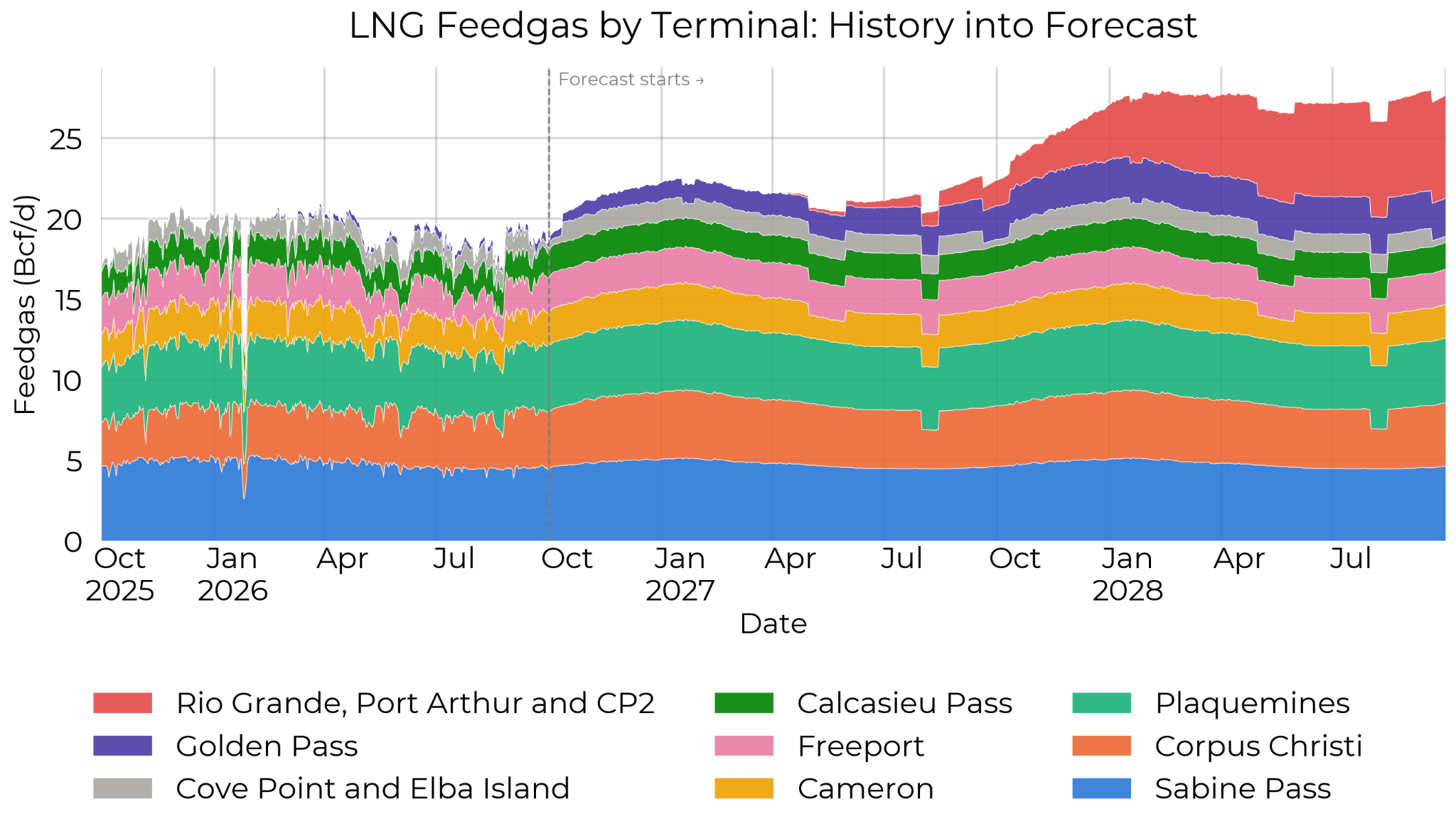
Each band is one terminal. The ramps in the forecast are new trains coming online; the dips are scheduled maintenance; the gentle seasonal wave across the whole stack is the effect of temperature on utilisation.
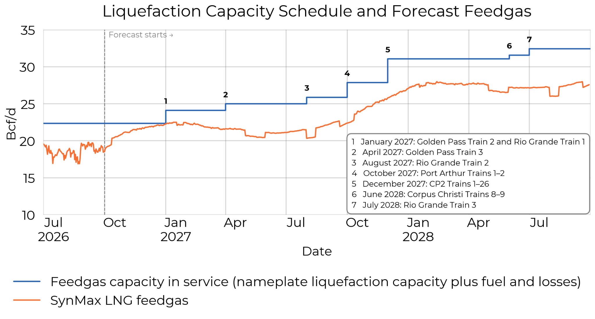
The gap between the capacity line and the feedgas line is the ramp: capacity steps up on each in-service date, and feedgas catches up over the following months. This makes it easy to see which start-ups drive the growth in each quarter.
US-to-Mexico Pipeline Exports
Pipeline exports to Mexico are forecast daily at the national level. The level comes from EIA's Short-Term Energy Outlook for US pipeline exports, blended with a carry-forward of the most recent EIA monthly data, so the forecast stays close to observed flows in the near term while following EIA's view of growth further out. Mexico's share of total pipeline exports follows a seasonal curve driven by degree days, reflecting the summer peak in Mexican power demand.
Each month's level is then spread across its days using weekday patterns and the border-region weather forecast, which shape the path within the month without changing the monthly total.
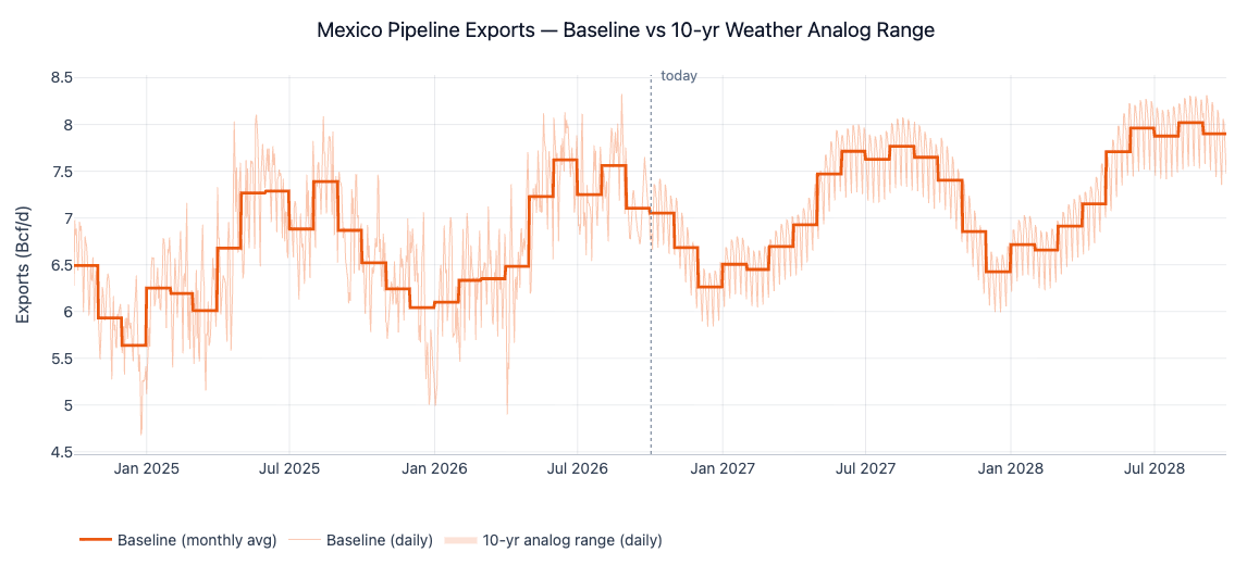
The step lines are the monthly levels and the daily line shows the shape within each month. The summer peaks reflect Mexican power demand for cooling; the level from year to year follows EIA's outlook for pipeline exports.
Canada–US Pipeline Trade
Canadian imports and exports are forecast separately, daily. Imports follow a seasonal pattern and US heating demand; exports follow their own seasonal pattern and heating demand in eastern Canada. Both carry a gently damped trend and the persistence of recent flows, so the near-term forecast stays close to what is moving across the border today. Imports enter the balance as supply and exports as demand.
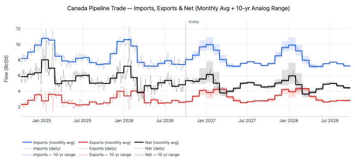
Imports rise through the winter as US heating demand pulls more Canadian gas south; exports rise with eastern Canadian heating load. Net imports, the difference, are what matter for the US balance.
LNG Imports
LNG import sendout is a winter peaking resource. The forecast first estimates the chance that the import terminals send gas out on a given day, then how much, both driven by heating degree days in the areas Cove Point and Everett actually serve. Outside November through March the forecast is zero, matching observed behavior.
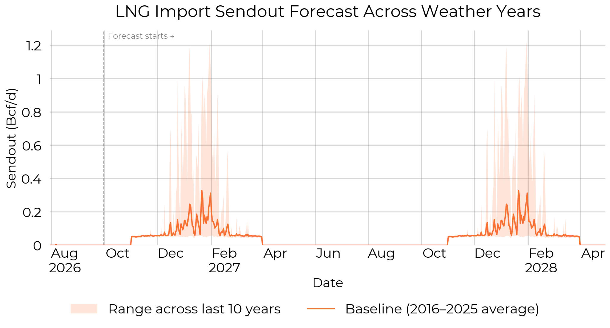
Sendout appears only in winter, and the shaded range is wide: in a mild winter the terminals barely run, while a cold one can bring repeated sendout days. The baseline shows the typical winter total, and the range shows how much weather can move it.
Supporting Components
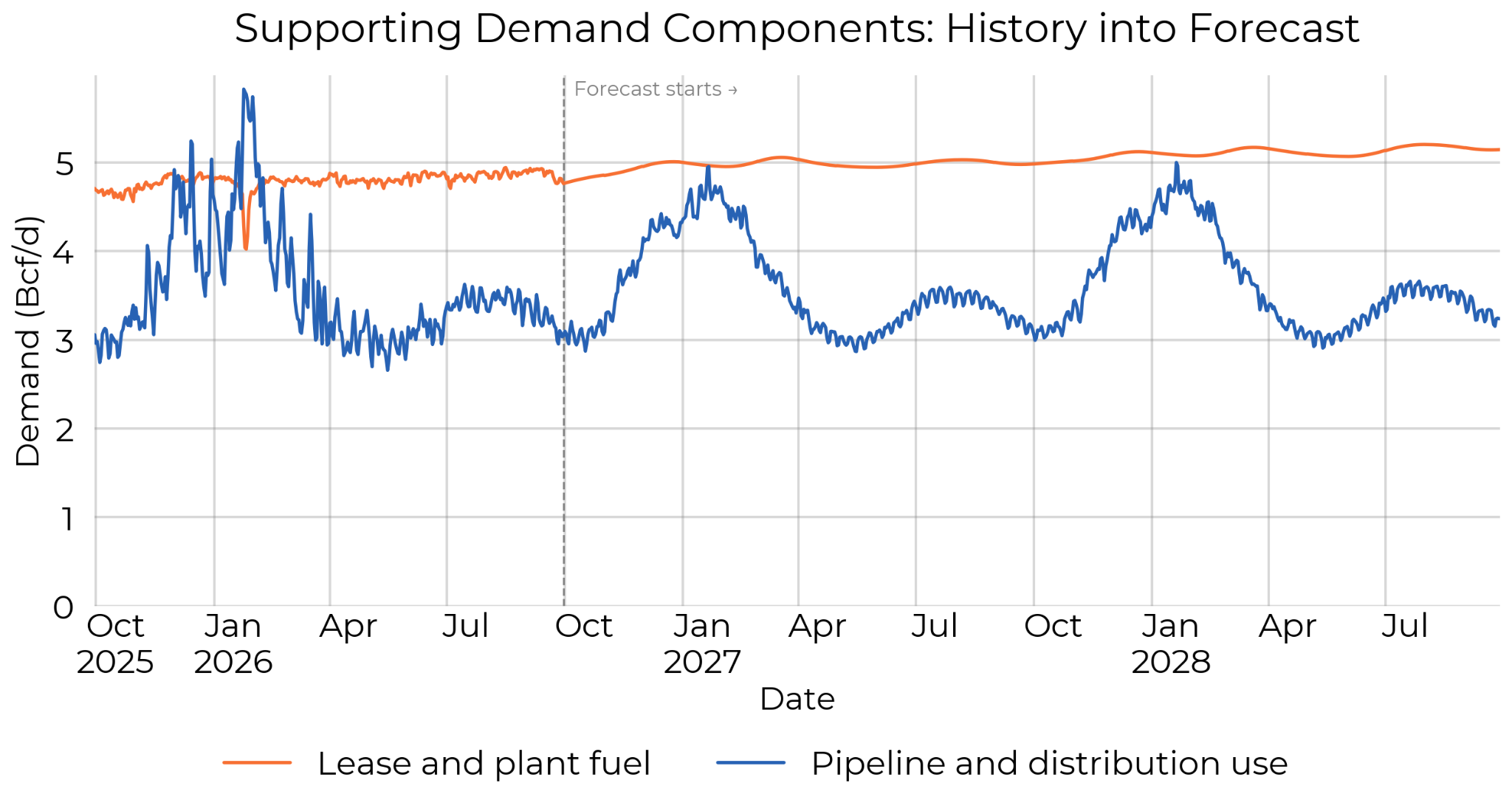
The smaller components follow their own drivers forward. Lease and plant fuel moves with our production forecast, so projected production growth shows up directly as fuel use. Pipeline and distribution use is forecast as a share of total forecast throughput. Vehicle fuel is small and steady, so we carry the latest EIA figure forward.
Supply
On the supply side, production comes from our daily production estimate, joined onto a SynMax long term production forecast, so it runs continuously from measured to projected volumes. The long-term forecast is monthly, so we convert it to a smooth daily path that still averages to each month's forecast figure. We also watch for maintenance notices and other supply events, and adjust the near-term outlook when they occur. Canadian pipeline imports and LNG import sendout, covered above, complete the supply picture.
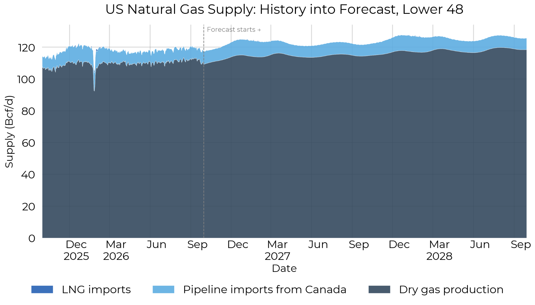
Production dominates the stack; Canada imports add a seasonal layer and LNG imports a thin winter sliver. Growth in the production forecast is the main counterweight to growth in LNG feedgas on the demand side.
Storage Outlook
Supply minus demand gives the daily balance, i.e. the storage injection/withdrawal. Starting from the latest EIA weekly storage report, we accumulate the forecast balance day by day into a projected working gas trajectory, one for each weather year. A small balancing factor, modeled on the historical gap between measured flows and reported storage changes, is included so the projection lines up with how EIA reports production (our production estimates are NOT calibrated to EIA, but rather state reported data, so we have a persistent difference when balancing to storage).
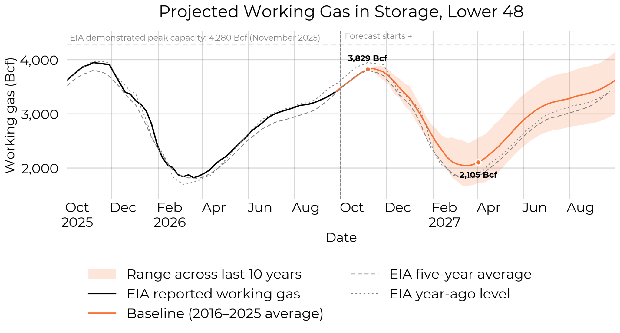
The line picks up from the latest EIA report and projects storage through the next injection and withdrawal seasons. The shaded area shows the range of expectations based on demand for the last 10 years of weather.
| Season end | Projected inventory (Bcf) | Range across last 10 years weather (Bcf) | EIA five-year average (Bcf) | Year-ago inventory (Bcf) |
|---|---|---|---|---|
| End of injection season (Week ending 6 Nov 2026) | 3,829 | 3,821 to 3,834 | 3,809 | 3,950 |
| End of withdrawal season (Week ending 2 Apr 2027) | 2,105 | 1,724 to 2,566 | 1,853 | 1,900 |
What's Next
The demand forecast is available now, alongside our daily demand history, so the full supply, demand, and storage balance can be read from measured history straight into the next two years. As always, if you have questions about the methodology or how to access the data, reach out at support@synmax.com.